“You did a wonderful job, I couldn't ask for anything better. Flowers on it were perfect, the colouring was spot on.”
-Bride
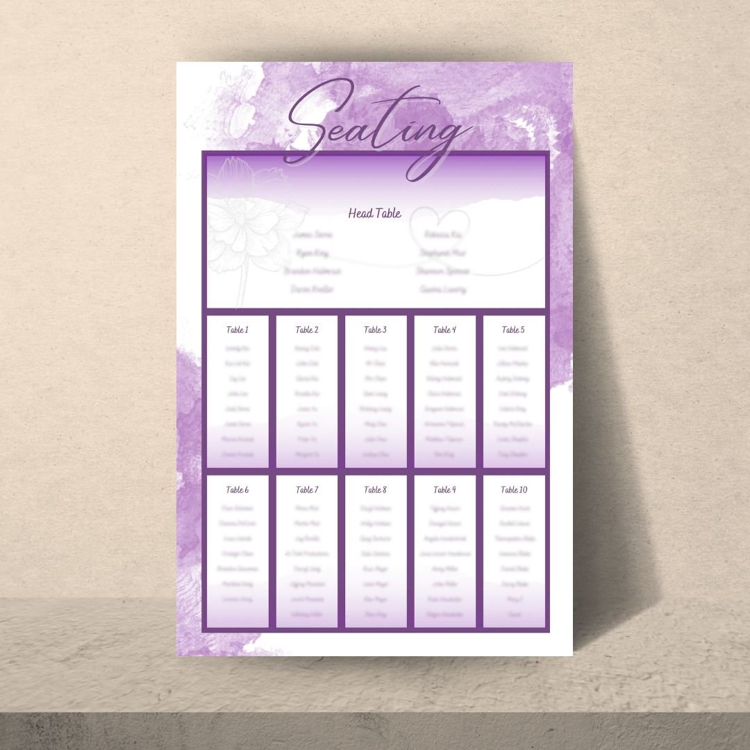
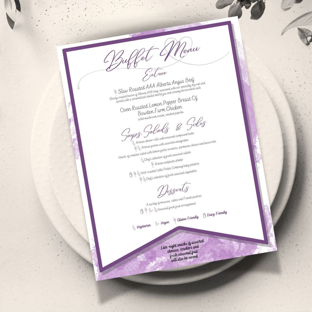
For this wedding, the task was to design and produce essential print materials that included menus, name tents, and a seating chart, which were pivotal in enhancing the guest experience and complemented the event’s colour theme and decor. The bride provided a specific colour palette of lavender and deep violet and allowed creative freedom within these constraints. The designs aimed to reflect a regal yet accessible tone, matching the overall elegant theme of the wedding.
Creative Approach
Adhered to the bride's specified shades of lavender and deep violet, ensuring all print materials were visually harmonious with the wedding’s overall colour scheme.
Incorporated dainty linework flowers and subtle heart accents to add a romantic, personalized touch to each piece.
Used watercolour textures in the background of each item to create a soft, cohesive look across all print materials.
Selected a fancy, yet easy-to-read font for guest names and menu items. This choice maintained the elegance of the wedding theme while ensuring readability.
Menus and Name Tents: Carefully placed in front of each seat, these items were designed to be both functional and decorative.
Seating Chart: A large, clearly organized seating chart was positioned at the entrance of the reception venue to guide guests to their designated seats efficiently.
The print materials were received with admiration and appreciation from both the couple and the guests. They enhanced the aesthetic appeal of the wedding reception and contributed significantly to the orderly flow and warm ambiance of the event.